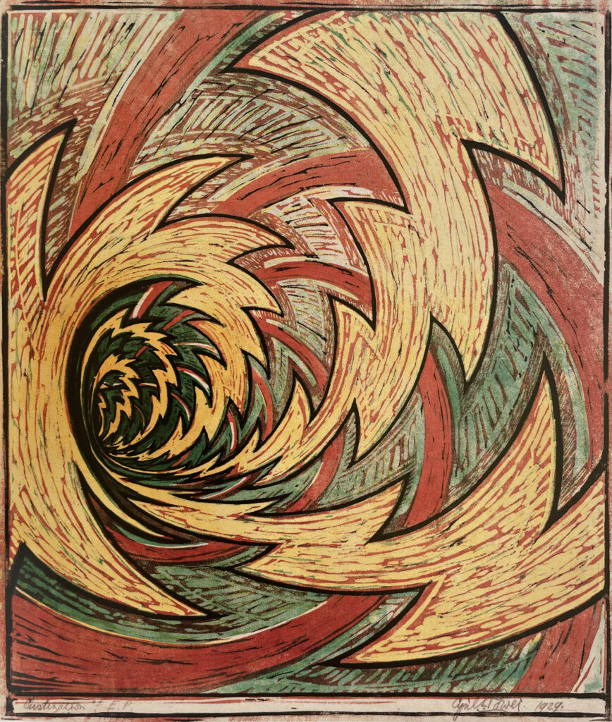
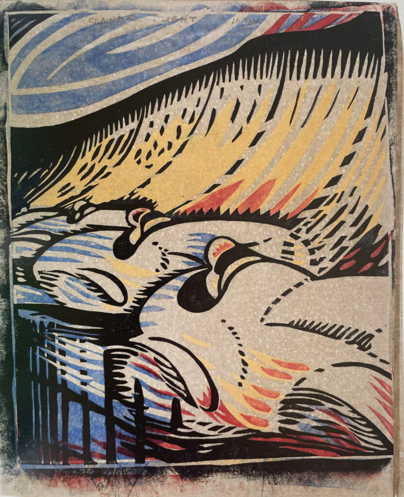
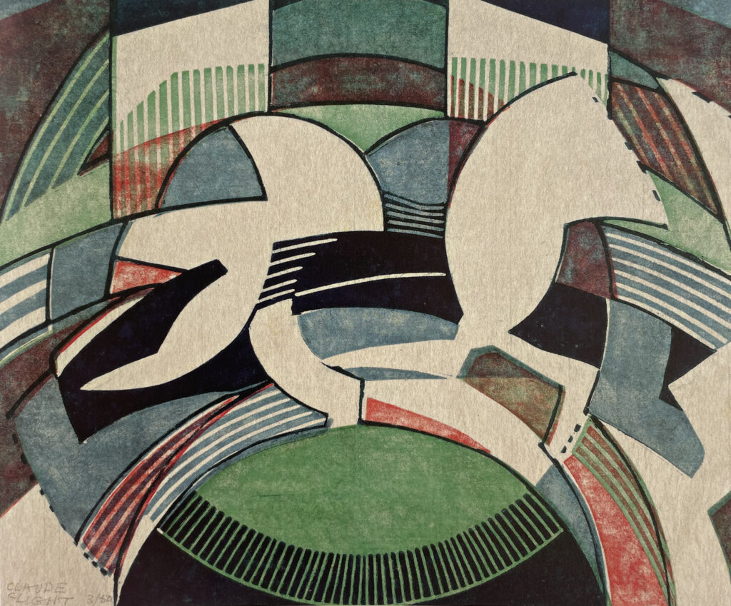
Claude Flight made the earliest Modernist motorsports linocuts in 1929, and one can feel his inspiration taken from the energy of high-speed racing at Brooklands, and the spectacular broadsliding, rooster-tail racing of dirt track, as it was known in the day. The compressed perspective of ‘Brooklands’ (1929) with its three hulking white cars, is reminiscent of Hokusai’s ‘wave’ woodcuts from the 1830s, as the banking and clouds threaten to crash over the cars speeding below. His ‘Dirt Track’ (1929) is more purely abstracted, and almost Art Deco in its repeated colors and circular/checkerboard motifs, although the rooster tail flung skyward and the rider’s arm/leg relationship are the last tethers to reality to what has become a nearly pure geometric abstraction. Both are 5-color linocuts, meaning Flight coordinated individual colorways on five different squares of linoleum carved to place those colors in specific areas. Flight was tricky with his inking, printing, and paper, often printing on very sheer Japanese paper, which was then pressed onto a thicker paper of another color or visible texture that added a subtle textural depth to his work. When depicting vehicles (as with ‘Brooklands’), he used paper with metallic flecks beneath his Japanese paper, which translates in the aggregated image as metal bodywork. This appears as an interesting blotchiness in reproduction here, but is beguiling in person.
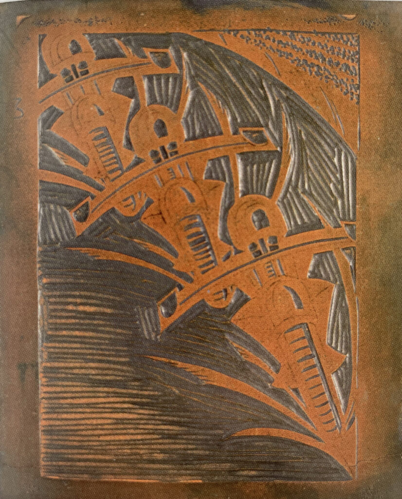
Flight’s student Sybil Andrews made one of the most iconic and recognizable motorcycle images in all British Modernism, barring purely graphic work by the likes of American expat Edward McKnight Kauffer. Her ‘Speedway’ of 1934 (the sport had changed its name by then from ‘dirt track’) is a 4-color linocut of three riders in tight formation, with the curved trackside fence and blotches of color suggesting a crowd flashing by. ‘Speedway’ is perhaps the most Modernist motorcycle image of all, as while it abstracts the riders and their machines into a repeated motif, they are still instantly recognizable, bearing directly at the viewer in a menacing trio totally intent on their purpose. I’m not the only one who thinks so, as rare examples of this linocut sell for a year’s wages – on a very good year.
Sources:
- British Prints from the Machine Age. Clifford Ackley ed. Thames and Hudson, 2008
- Avant-Garde British Printmaking, 1914-1960. Frances Carey, Antony Griffiths, Steven Coppel. British Museum Publications, 1990
- Sybil Andrews: Color Linocuts. Glenbow Museum, 1982
For more:
 Paul d’Orléans is the founder of TheVintagent.com. He is an author, photographer, filmmaker, museum curator, event organizer, and public speaker. Check out his Author Page, Instagram, and Facebook.
Related Posts
San Francisco Art Deco Day, 2006
The Legion of Honor Museum of San…
Legend of the Motorcycle Attire
It was an event that changed the…
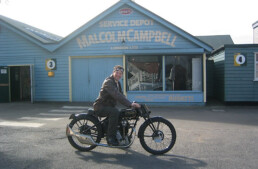
Brooklands Again: Malcolm Campbell’s Workshop
The Brooklands speed bowl was founded…
As the SS officer in ” Hogans Heroes ” would of said ;
” Interesting …. vellee interesting ”
Can’t quite make up my mind whether I likes it or not … but velllee interesting indeed